
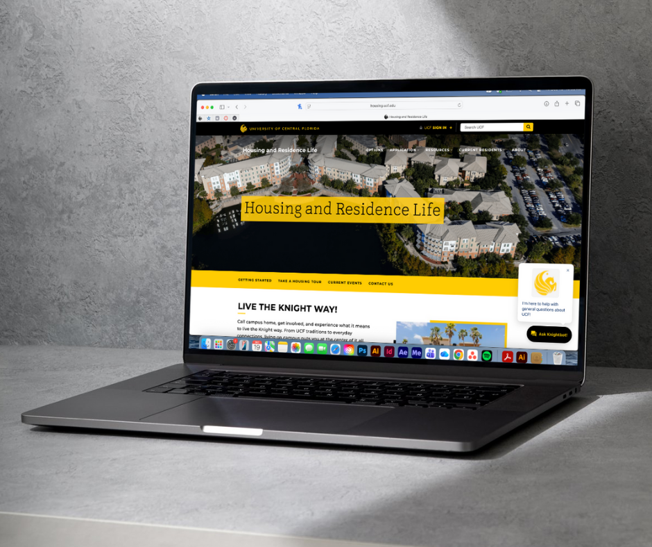
UCF Housing Website Redesign
UCF Housing’s website plays a critical role in helping prospective and current students make housing decisions. However, during high-traffic periods, key information was difficult to find, creating friction in the user journey and increasing reliance on support channels.
I led the website redesign in collaboration with a web development team, aligning content, navigation, and page structure with user intent. My approach prioritized clarity, accessibility, and conversion-focused actions to improve the overall user experience.
The problem.
The existing website contained a large amount of housing information but lacked a cohesive visual structure. Important resources were difficult for students to locate, and the visual design did not fully reflect UCF Housing’s evolving brand identity.
The redesign aimed to:
I focused on making the site easier to navigate and the information clearer and less overwhelming. I also brought in a more consistent visual style that better matches UCF’s branding so everything feels more cohesive. The goal was to support both prospective and current students, with clearer paths depending on what they need. I made sure key things like applying for housing, finding move-in info, and accessing resources are easier to find so users can get what they need without digging around.
My Responsibilities:
Designed updated page layouts and visual components for key housing pagesI led the website redesign and worked closely with a web development team to create a more intuitive, user-friendly experience. Using insights from user behavior and Google Analytics, I restructured the content, navigation, and page layout to better match how people actually look for housing information. Throughout the process, I focused on making everything clearer, more accessible, and easier to navigate, while highlighting key actions so users can quickly find what they need.
Brainstorming.
I created a Miro board to keep all brainstorming elements in one place for the team to comment on and review.
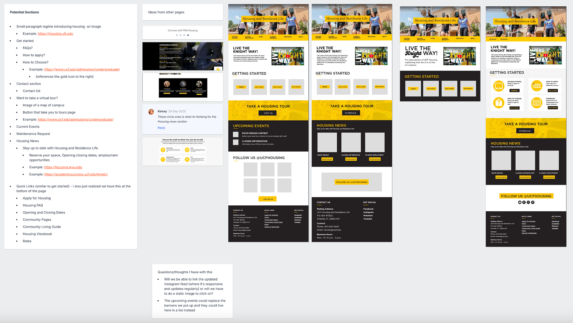
My Approach.
The redesign focused on creating a cleaner and more visual design. I used clear visual hierarchy, bold headings, and consistent elements to help students quickly scan information and find what they needed.
Housing photography and graphic elements were used to highlight community life while maintaining a structured layout that supported accessibility and readability.
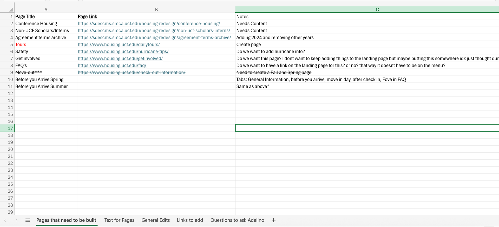
An Excel document was created to track progress, keep teams updated, document questions about the project, and organize text for each page.
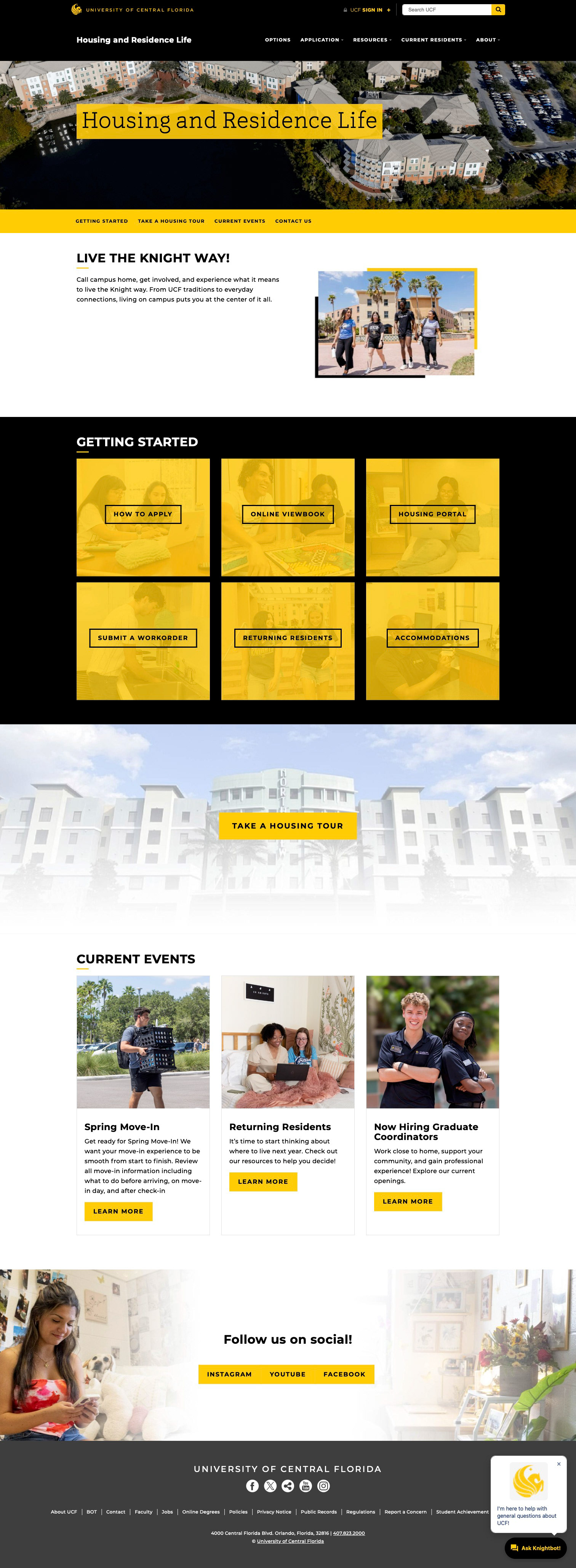
Before
After
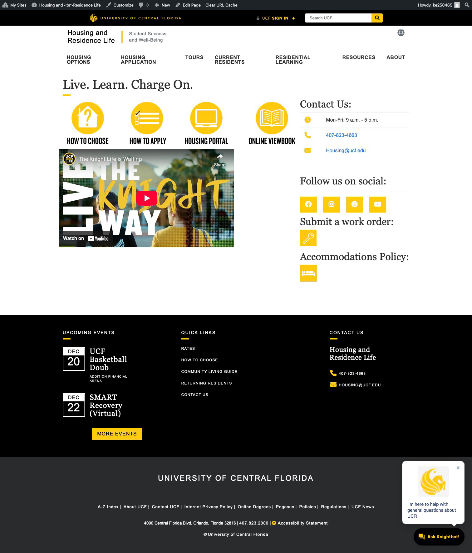
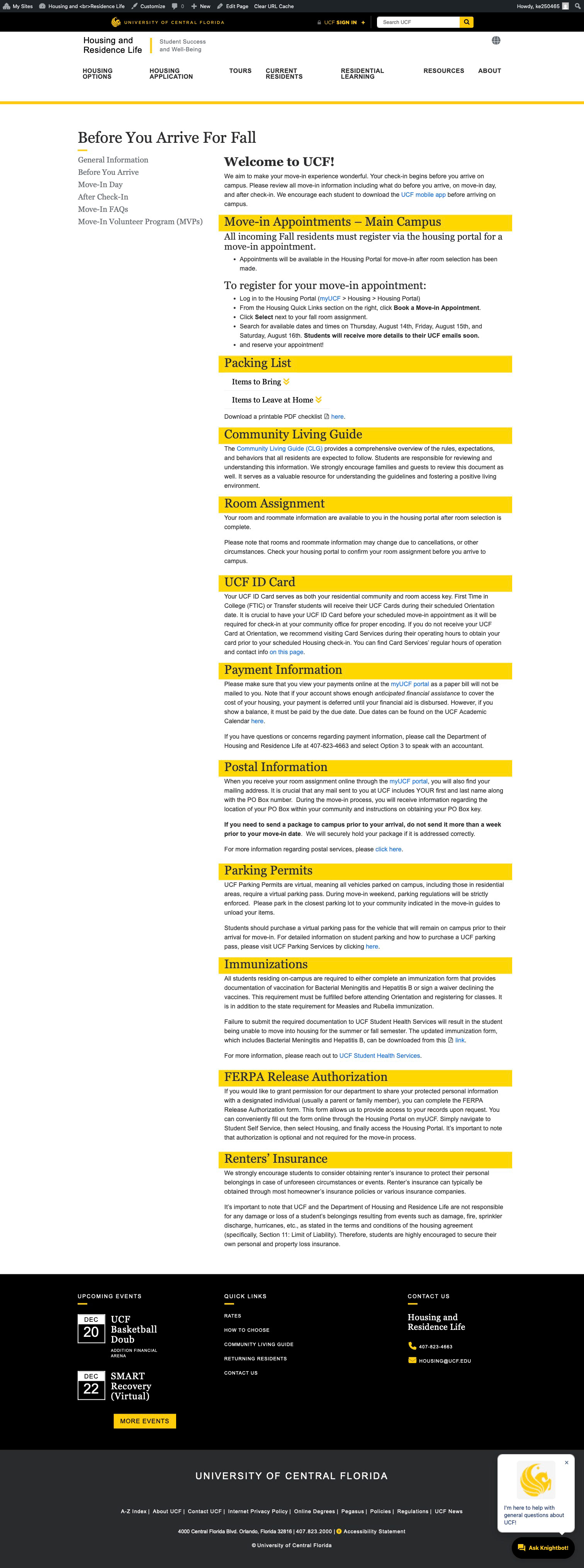
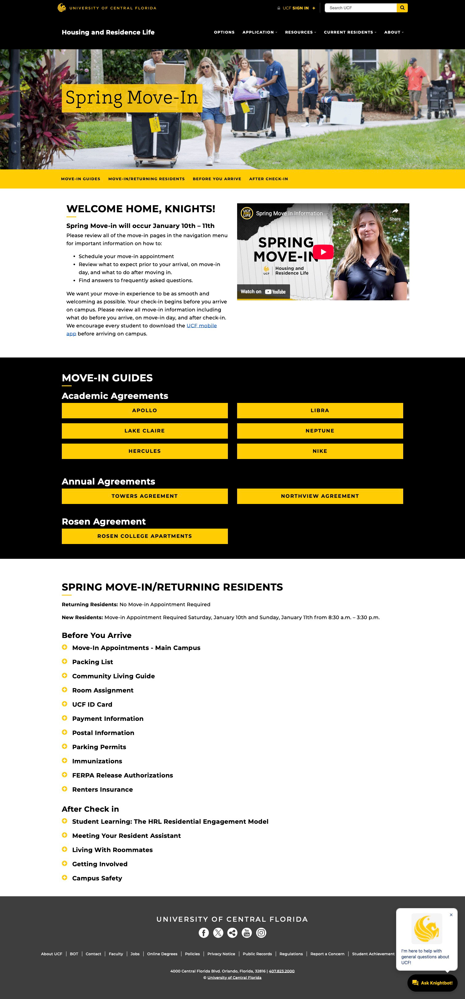
Before
After
Impact.
Reduced total pages from 64 to 34, consolidating content for clarity and easier navigation.
Improved visibility and accessibility of key resources, making it easier for students to locate information quickly.
Increased page views by 32% compared to last year (2025).
Traffic Acquisition:
Organic search: 59.79%
Direct search: 34.79%
User engagement:
Average session: 5 minutes 3 seconds