
Overview.
The UCF Housing Viewbook was created as a visual guide to help prospective students and families learn about living on campus. The goal was to highlight housing communities, amenities, and student life while presenting information in a way that feels engaging and easy to browse.
The design combines strong photography, clear typography, and structured layouts to help readers quickly understand what living in UCF Housing is like.
The Challenge.
Housing information can be dense, especially for students who are just starting to explore their options. The challenge was organizing a large amount of information into a format that felt approachable and easy to navigate.
The viewbook needed to:
Introduce prospective students to on-campus housing
Highlight community amenities and student life
Stay consistent with UCF’s brand identity
Present information in a way that was visually engaging and easy to scan
My Role.
Designed page layouts for the digital housing viewbook
Organized content to create a clear flow of information
Used typography, spacing, and imagery to create visual hierarchy
Applied UCF Housing branding across all pages
Collaborated with housing staff to ensure messaging supported department goals
Design Approach.
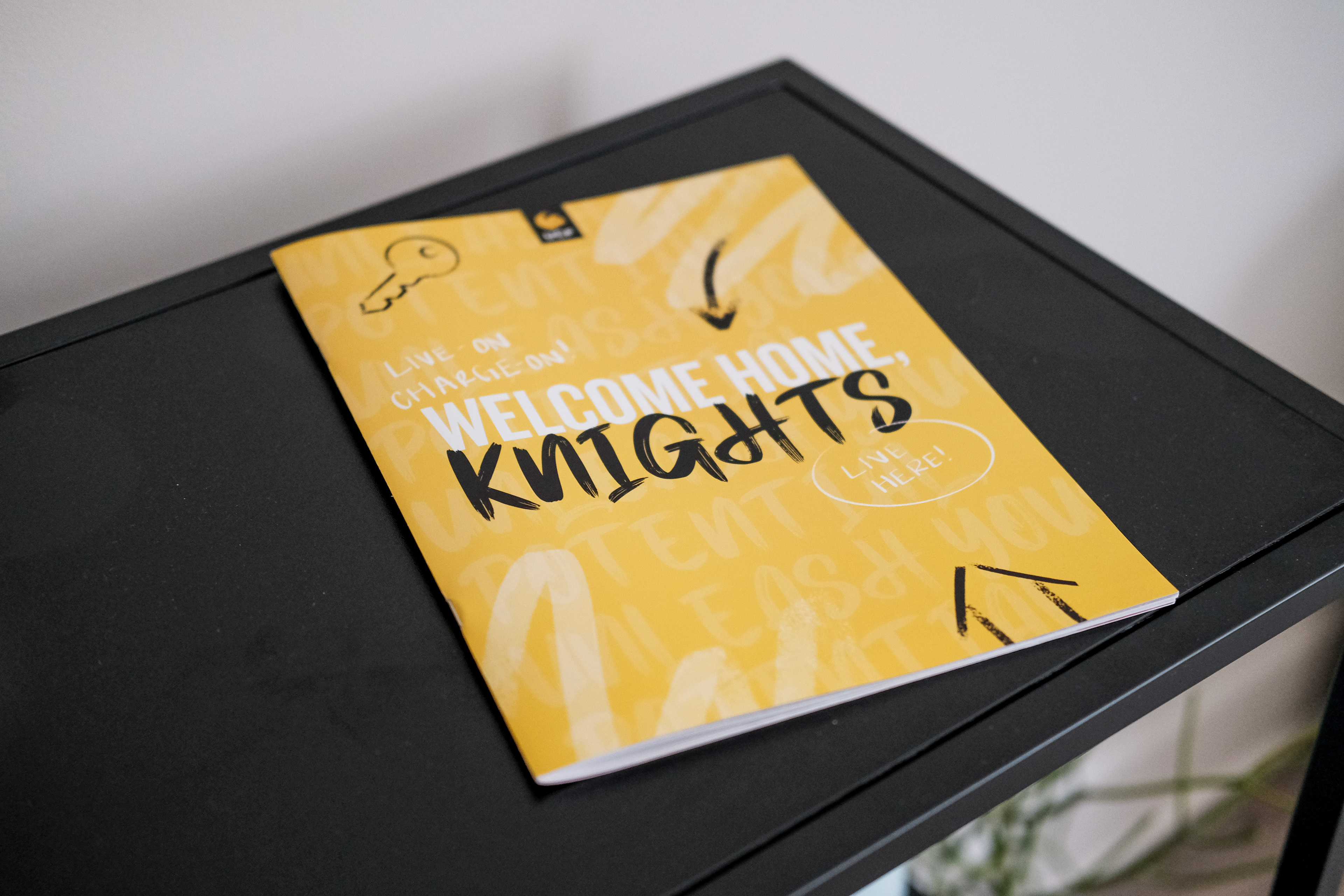
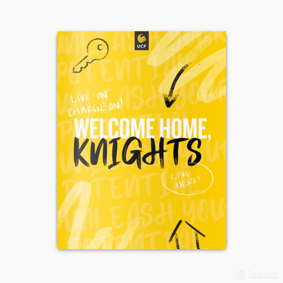
The viewbook was designed to tell a visual story about the on-campus living experience. I used a clean grid system and strong headings to help guide readers through the content while keeping pages visually balanced.
Photography of students and housing spaces helps bring the community to life, while bold section headers and spacing break up information into smaller, more digestible sections. The black and gold color palette reinforces UCF’s branding and keeps the design consistent with other Housing materials.
Research/ Brainstorming.
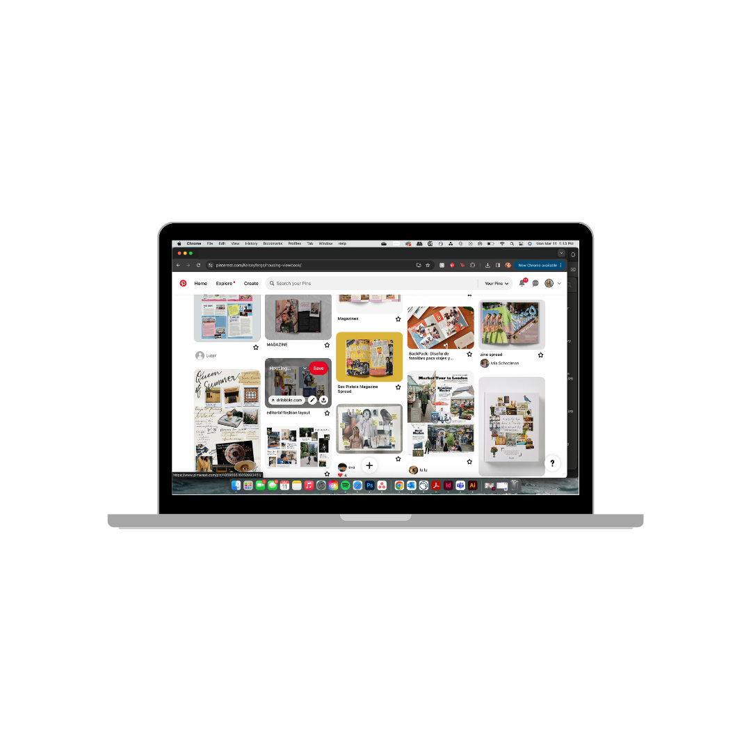
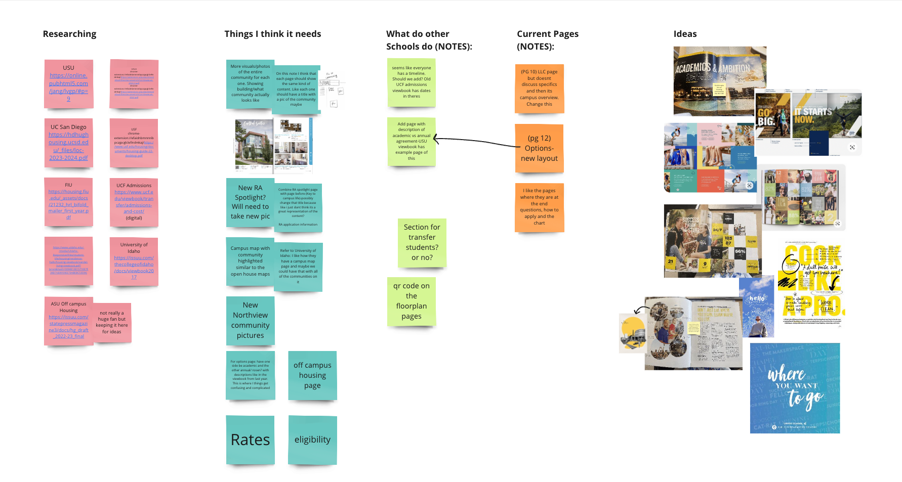
Before starting the design, I spent time exploring how other universities present housing information in their recruitment materials. Using Miro, I created a brainstorming board to organize ideas, gather inspiration, and map out the structure of the viewbook.
I reviewed housing viewbooks and admissions materials from several universities to understand how they highlight student life, amenities, and community features. This research helped identify common patterns, such as strong lifestyle photography, clear section navigation, and simplified information layouts that make it easier for prospective students to browse.
Insights from this research informed the direction of the design. I focused on creating a layout that balanced engaging visuals with clear information hierarchy, while also highlighting what makes UCF Housing unique.


Design Elements.
Clear hierarchy
Large headings and structured layouts make it easy for readers to scan and quickly find important information.
Photography
Images of student life and housing spaces help prospective residents imagine themselves living on campus.
Brand consistency
Typography and color choices align with UCF Housing’s overall visual identity.
Style
A scrapbook-inspired visual style was chosen to reflect current design trends and better connect with the student audience.


Click on the gif to view the entire book! ^^^